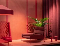
Exhibition of entrants
Brit Insurance Designs of the Year
Arabstoday
How do you compare the design of a concrete and canvas emergency shelter to that of an iPad? Is it possible to rank a Lanvin dress against the Barclays Cycle Hire program that was introduced by the mayor of London? Although it may seem a challenge too fat, this is exactly what the Design Museum in London is attempting with its current exhibition, the Brit Insurance Designs of the Year, which runs through Aug. 7. Now in its fourth year, the multidisciplinary award program encompasses designs from around the world, across seven categories: architecture, fashion, furniture, graphics, interactive, product and transport. About a dozen designs made it into each category, from which winners were announced today. To make its selection, the museum invited a number of design insiders, from Paola Antonelli, the senior curator in the department of architecture and design at the Museum of Modern Art, to Will Hudson, the founder of the blog It’s Nice That, to put forward nominations. A jury then selected winners in each category as well as an overall Brit Insurance Design of the Year (to be announced on March 15). The architecture nominees include Thomas Heatherwick’s UK Pavilion at the Shanghai Expo 2010 and dramatic tape installations by the Croatian/Austrian collective Numen/For Use. The category winner is a well-considered, community-oriented open-air library in Magdeburg, Germany, by Karo Architekten. The winner in the product category is the Plumen 001 low-energy light bulb, which beat out the ubiquitous iPad, Dyson’s blade-free fan and many others that can be seen in the exhibition. The other winners include Jil Sander for Uniqlo (fashion), Industrial Facility’s Branca chair (furniture), the “Homemade Is Best” cookbook, designed by Forsman and Bodenfors for Ikea (graphics), the Flipboard iPad app (interactive) and the Barclays Cycle Hire (transport). While it is possible to argue over the winners as one would at the Oscars, it makes more sense to see them in the context of the wider long list of nominees at the exhibition, where one can more easily see design trends emerge. The objects in the exhibition are not separated into their categories, as one might expect, but around themes. So in “City,” a Lanvin dress from spring/summer 2011 stands proudly next to a Fiat 500 TwinAir. In “Home,” Nendo’s Thin Black Lines furniture is exhibited next to a model of MVRDV’s Balancing Barn. Design, as it is displayed here, encompasses a lot. The one product shown that has had the greatest impact over the past year is undoubtedly the iPad – and many iPad applications have also made it into the exhibition. That said, books are also well represented, by the likes of the Four Corners Familiar Series of classic novels reimagined by John Morgan Studio and collaborators. Dorian Gray never looked so good. While there are gaps in the exhibition and some inclusions could be challenged, it is definitely better that an award like this one exists. If nothing else, it gets people asking questions about what design is, what good design is and how you go about judging it.
GMT 05:14 2024 Wednesday ,07 February
Sophisticated Classic Dining Room Design IdeasGMT 12:12 2017 Thursday ,21 December
Modern colorful bedroom renovationGMT 12:15 2017 Monday ,18 December
Sophisticated Classic Dining Room Design IdeasGMT 07:55 2017 Sunday ,17 December
10 quirky looks for people in bold,busy patternsGMT 07:34 2017 Thursday ,14 December
Outdoor Christmas decoration ideasGMT 12:58 2017 Wednesday ,13 December
11 shade solutions to enjoying your outdoorGMT 11:40 2017 Monday ,11 December
3 Ways to Find the Best Interior Design IdeasGMT 11:18 2017 Wednesday ,29 November
Why You Should Choose Oriental

With Job Cuts, China Deal
France's Carrefour revamps operations
Paris - Emiratesvoice
France's Carrefour group said Tuesday it is overhauling its business in a transformation plan involving thousands of job cuts, a product revamp and new partnerships in China. Carrefour, which was the world'sTo partake in Beiteddine Festivals
Singer Bruni arrives in Beirut Sunday evening
Beirut - NNA
French renowned singer and supermodel, Carla Bruni, is expected to arrive this evening at Rafic Hariri International Airport in Beirut, accompanied by her husband, former French President Nicolas Sarkozy. BruniIn France
Microsoft to open 4 data centres
Paris - Emiratesvoice
Microsoft is to open 4 data storage centers in France to meet strong customer demand for cloud computing, the head of the software giant's French operations told the Agence France-Presse onIn Olympic Spotlight
'Friendly and kind' N. Korean skaters
Taipei - Emiratesvoice
North Korea's figure skaters Ryom Tai-Ok and Kim Ju-Sik are "friendly and kind and a little bit shy", South Korea's Kim Kyueun said Tuesday ahead of their hugely anticipated Olympic appearance. The skater is competing with her partner Alex Kam in theFor $11.6 Bn
Sanofi buys US haemophilia treatment
Paris - Emiratesvoice
French pharmaceutical firm Sanofi said Monday it had reached an agreement to purchase US biotech company Bioverativ, which specialises in treatments for haemophilia and rare blood disorders, for $11.6 billion. Sanofi's chief executive Olivier Brandicourt said the acquisition "enhances its presence in specialtyParis show pays homage
to 'eternal style' of late Alaia
Paris - Emiratesvoice
Two months after legendary designer Azzedine Alaia's sudden death plunged the fashion world into mourning, an exhibition in homage to the "King of Cling" opens Monday in his studios in Paris. The Tunisian-born designer, renowned for the way his clothes hugged the body, died suddenly in November aged 82, reportedly of heart failure after falling down the stairs at his home. The diminutive maverick, who ignored fashion week convention by showing when and where he wanted, in July produced his first couture collection in six years to rapturous reviews. Now some of his most iconic dresses are going on display in the glass-roofed gallery next to his studio and home in the Marais district where he used to show his creations. It includes the dress worn by supermodel Naomi Campbell, his longtime friend and muse, when she ledMaintained and developed by Arabs Today Group SAL.
All rights reserved to Arab Today Media Group 2021 ©
Maintained and developed by Arabs Today Group SAL.
All rights reserved to Arab Today Media Group 2021 ©


Send your comments
Your comment as a visitor